At Nourish Care we’re committed to continuously improving the accessibility and inclusivity of our technology, working towards our goal of developing a solution which truly works for everyone. We spoke to our Head of Product Design, Kate Horn, to learn more about our approach to embedding accessibility and inclusivity at the heart of our product design process.
“Accessibility and inclusivity have accidentally become a bit buzzwordy in the design world recently,” explains Kate, “and most definitely in health tech design. Why? Finally, we are all talking about ensuring that anyone can access the products we are creating. At Nourish these are not just words, they form the basis of design values that go right to our core, we are person-centred. We believe in a better life for everyone. To achieve this, we need to make sure anyone and everyone can use Nourish.”
Accessibility and inclusivity are hot topics in care technology right now, but what do those terms really mean?
“Honestly? They mean quite a lot of different things!
“It is a common misconception that when we talk about accessibility, we are only talking about how we apply colours to designs and how we can make it high contrast. This is a factor, but it barely scratches the surface of the work to be done to make a platform, or an app genuinely accessible to anyone who wishes to use it.
“Hold on a moment though, we are talking here about using something that is in your hand already. We need to take a step back and think about the technology and very basic level of access first and how, as designers, we can get the app into your hand or onto your desktop in the first instance. Given that you are reading this digitally, this is clearly not a problem for you but consider this; in 2022, 13-19 million people in the UK over 16 lived in a state of digital poverty. That means they did not have the tech, skill, or resources to fund internet access on one or more occasions a week.


We cannot just build for the latest and most shiny versions of everything. Accessibility means we need to think about making sure what we create is available to everyone. In a way which does not exclude people, starting at the point of access and empowering them to enjoy the full experience of the platform.
“Inclusive” needs to go even further and it is worthy of a blog post on its own. For now, I want to touch on the importance of ensuring that inclusivity extends to individuals feeling genuinely included, seen and represented within our platforms.
How then do we approach design at Nourish to be accessible and inclusive?
First of all, we aim for the highest possible standard. There is a framework for accessibility in digital design for us to follow called WCAG. Within this there are levels, the highest of which is standard 2.2. This is what we strive to achieve. Standard 2.2 covers everything from the use of text, audio, layout, contrast, colour, platform adaptations, use of imagery, operational considerations, inputs, consistency of design and ensuring the platform is robust. And that’s just to start!
It is a solid start, however, a framework does not go far enough for accessibility and it doesn’t answer the requirement for inclusivity. To achieve this, there are several other elements to consider, starting with words.
Words are a powerful way for us to be both engaging and human, when used correctly. They are also one of the quickest ways for us to disconnect people from Nourish. If we describe areas of the platform or tasks using inhuman or technical language you first have to understand what we really mean and then have to choose if you really want to do it. We’re to make things simpler for you, not more complicated! So, step one for us is to speak in common English and start to create a comfortable experience.


Next on that list is understanding who we are designing for. This requires us to become so embedded in the health and care sector that we are a part of the furniture. Great insight means we understand the everyday challenges the people who are using our platform experience. This ensures we craft experiences for our platforms that work to solve these problems in a way that is comfortable for everyone.
How do you focus on solutions that work for everyone?
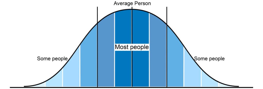
Throughout this blog I have used the words “anyone” and “everyone”. These are crucial terms for defining our approach. Typically, designers aim to design for the bell curve, that is, the biggest group of users.

We simply cannot do this in health and social care. We have to step back and design solutions that truly work for anyone. This “flattening” of the curve is really important. It goes to the core of what we work to achieve as a company and the heart of our values as a design team. We want to create technology to truly wrap around the user in a great experience.
So what does this mean for the Nourish platform?
As users of Nourish will know, we’re continuously improving the accessibility and inclusivity of the platform, these really aren’t just buzzwords to us. We are working towards our goal of creating a system which can be easily used by anyone. There’s always more that can be done but by keeping these principles and our users at the heart of our design processes we are able to keep our person centred goals firmly in sight.
Book a demo to find out more about Nourish and how we can work with anyone, and everyone in your community.


